SymphonyCare: Self-Service Kiosk Check-In Optimization
SymphonyCare is an iPad based medical check-in designed to make arriving for appointments easier for patients and staff. It lets patients check themselves in and scan their documents, helping reduce wait times, cut down on paperwork, and keep the front desk running smoothly.
Role & Expertise
Problem Statement
Medical facilities often suffer from long wait times and severe front-desk bottlenecks during peak hours. Traditional registration relies on receptionists manually entering patient details and copying insurance cards, a process averaging 10 minutes per person. This manual intake causes administrative errors, frustrates waiting patients, and diverts staff energy from critical patient care tasks.
How might we eliminate manual intake friction and data entry errors so patients can register independently in under 3 minutes, freeing reception staff to focus on high-touch patient care?
Project Goals
- • Reduce Check-In Times: Cut average intake duration from 10 minutes to under 3 minutes.
- • Eliminate Manual Errors: Utilize automated ID and insurance card scanning technology.
- • Relieve Front-Desk Congestion: Empower patients to handle registration independently via iPad kiosks.
- • Enhance Staff Efficiency: Free receptionists from data entry to focus on high-touch patient support.
Target Audience & Personas
Patients seeking a quick, private, and painless registration experience without standing in long lobby lines.
"I just want to check in quickly without standing in line or spelling out my name and insurance info out loud."
Front-desk teams needing accurate patient logs and freedom from repetitive manual paper processing.
"Half my day is spent typing information off paper forms and manually photocopying insurance cards."
Healthcare administrators focused on lobby turnover, patient satisfaction scores, and operational efficiency.
"Peak morning bottlenecks slow down doctors' schedules and drive down our patient satisfaction scores."
Discovery & Research Strategy
Discovery focused on identifying bottlenecks in busy clinic waiting rooms and designing an accessible self-service flow for diverse patient demographics.
Peer Designer Collaboration
Collaborated side-by-side with a fellow designer to brainstorm kiosk interactions, test wireframe hierarchy, and audit physical kiosk accessibility. Working as a design pair allowed us to quickly iterate on hardware-oriented touch targets and privacy controls.
Workflow & Competitive Analysis
Analyzed traditional clinic check-in workflows and existing self-service kiosks. We identified the main cause of user drop-off in healthcare kiosks was tedious form-filling on touchscreens; replacing manual forms with camera-assisted OCR card scanning emerged as our efficiency breakthrough.
Process Logic & Kiosk UX Architecture
Designing for a shared iPad kiosk in a busy waiting room presented unique hardware and privacy challenges compared to a personal mobile app.
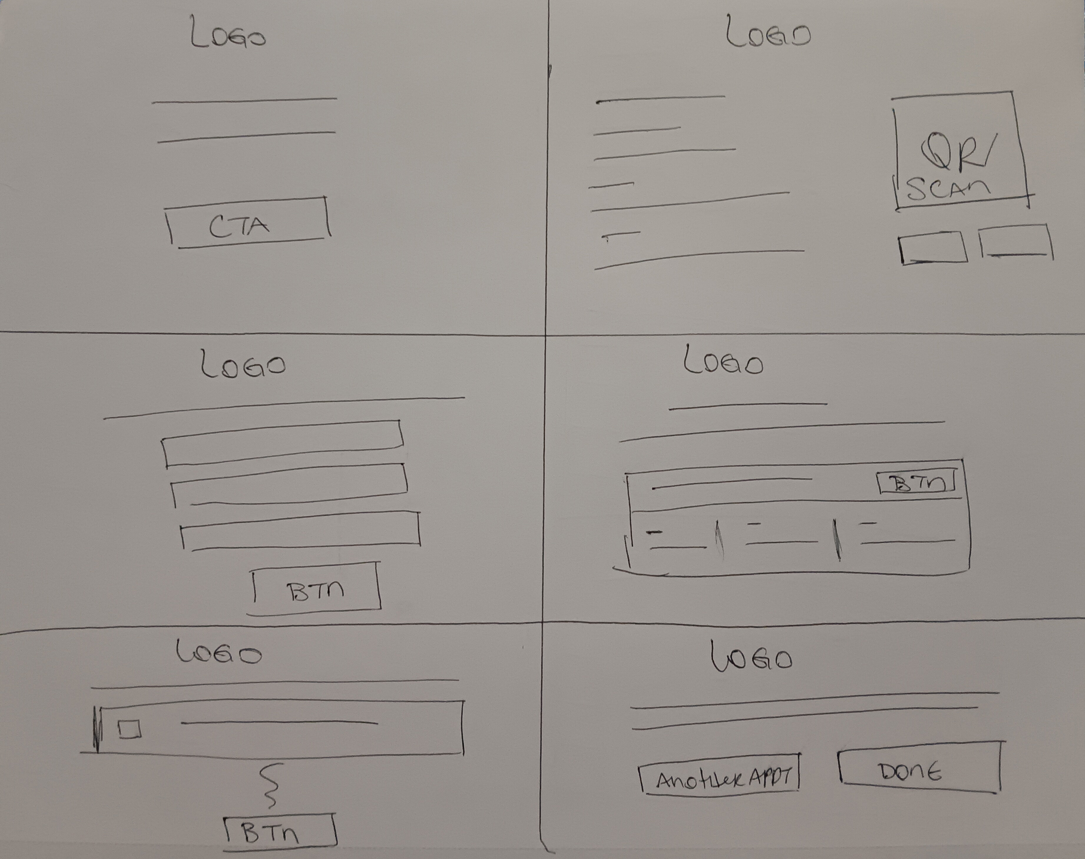
Key Architectural Decisions
- • High-Speed Authentication: Supported phone number lookup and appointment QR code scanning for instant 1-tap patient verification.
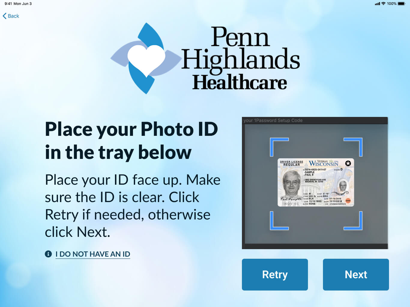
- • Camera-Guided OCR Capture: Built step-by-step visual frames guiding patients to scan both sides of their ID and insurance cards, populating records automatically.
- • Privacy-First Screen Timeout: Implemented automatic session resets and masked sensitive demographic data to safeguard patient HIPAA privacy in open lobby environments.
Key Features
1. Self-Service Kiosk Intake
Independent registration flow allowing arriving patients to confirm appointments and review medical records on an iPad.
2. ID & Insurance Scanning
Automated camera capture technology that extracts card details instantly, cutting manual entry errors.
3. Real-Time Administrative Sync
Instant data availability across front-desk dashboards and Electronic Health Record (EHR) systems.
4. Lines & Patient Flow Analytics
Centralized dashboard giving clinical staff live visibility into the number of patients in the lobby, check-in statuses, and patient delays.
Results & Impact
Prototyping and initial deployment models for SymphonyCare demonstrated dramatic improvements in clinic efficiency and patient experience:
66%+
Reduced Check-In Time (10m → 3m)
25%
Fewer Data Entry Errors
40%
Higher Patient Satisfaction
Streamlined
Front-Desk Congestion
By automating routine intake and card verification, SymphonyCare transforms front-desk operations allowing receptionists to dedicate their time to more complex patient needs while delivering a sleek, modern first impression.
Design Evolution
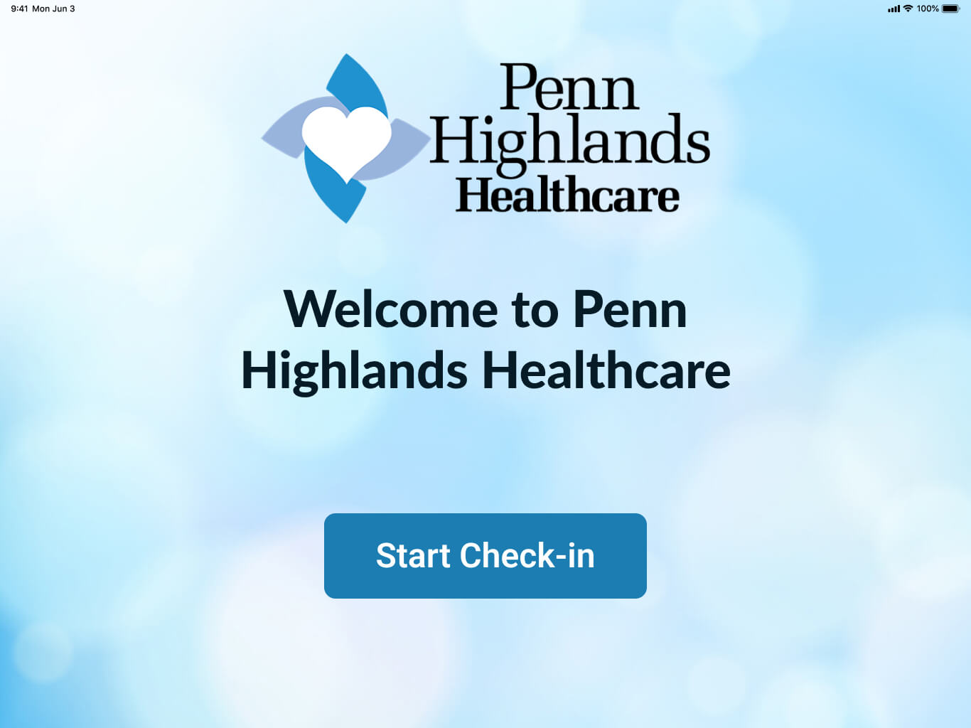
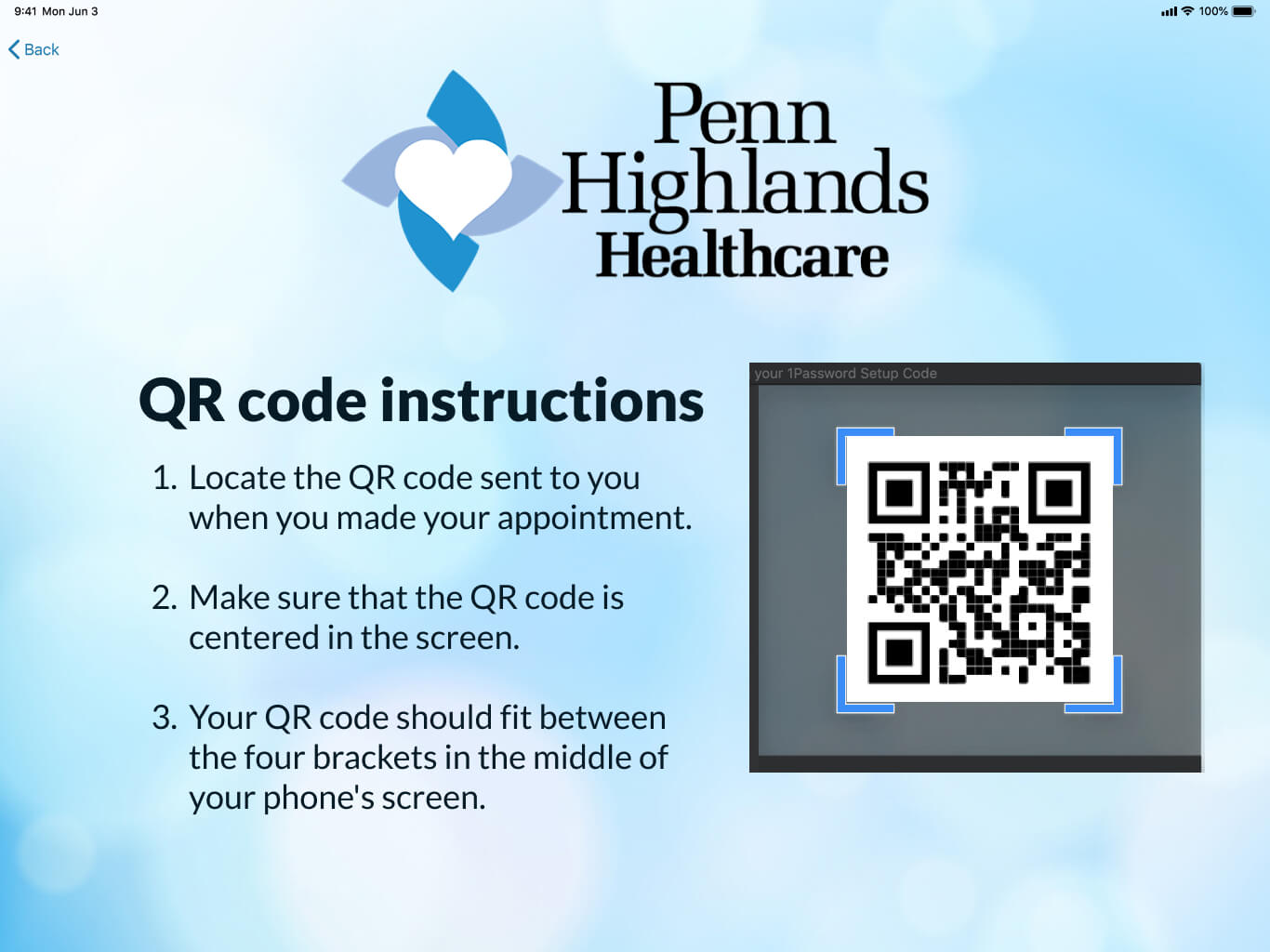
Welcoming Arrival & Fast Lookup
• Low-Friction Entry: We eliminated complex intake forms. Arriving patients tap a single prominent CTA and authenticate instantly using either a phone number lookup or by scanning a pre-appointment QR code sent via text or email.
Automated Document Capture
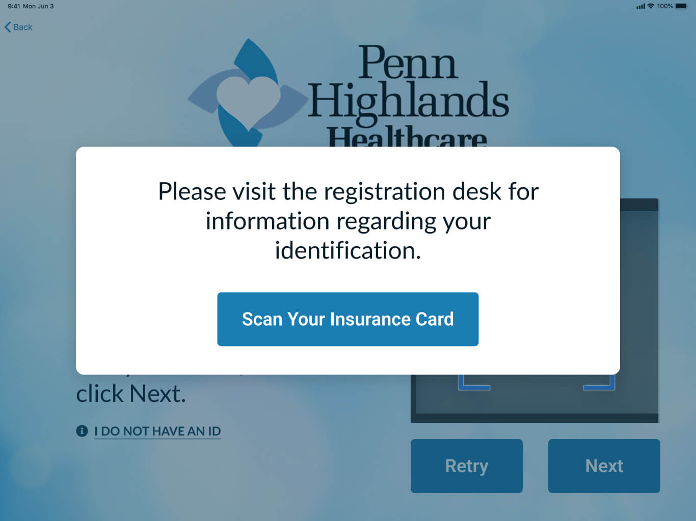
• Camera Guidance: To prevent blurry scans or misaligned photos from non-tech-savvy users, we designed high-visibility positioning frames with real-time feedback to patients.
Appointment Verification
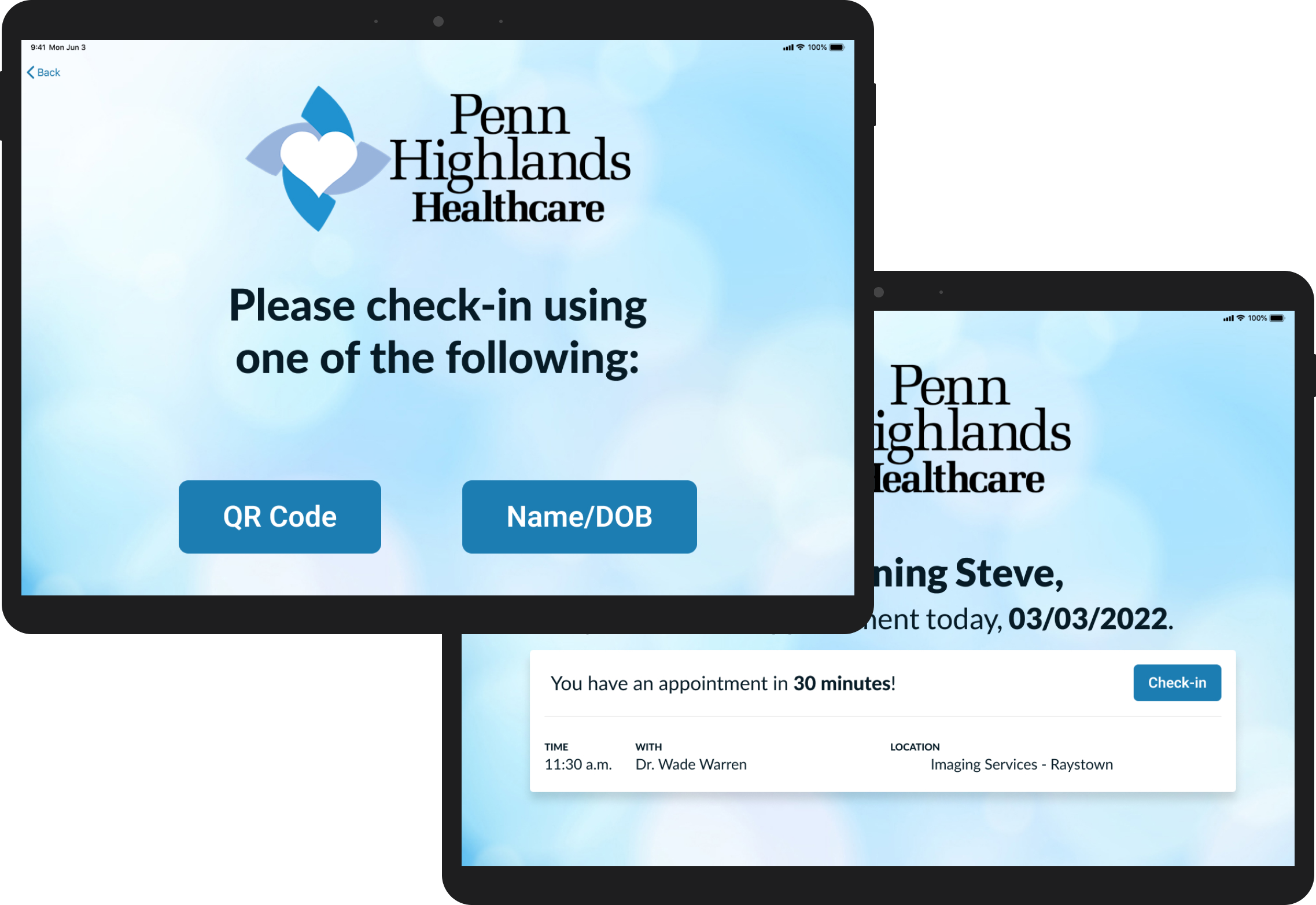
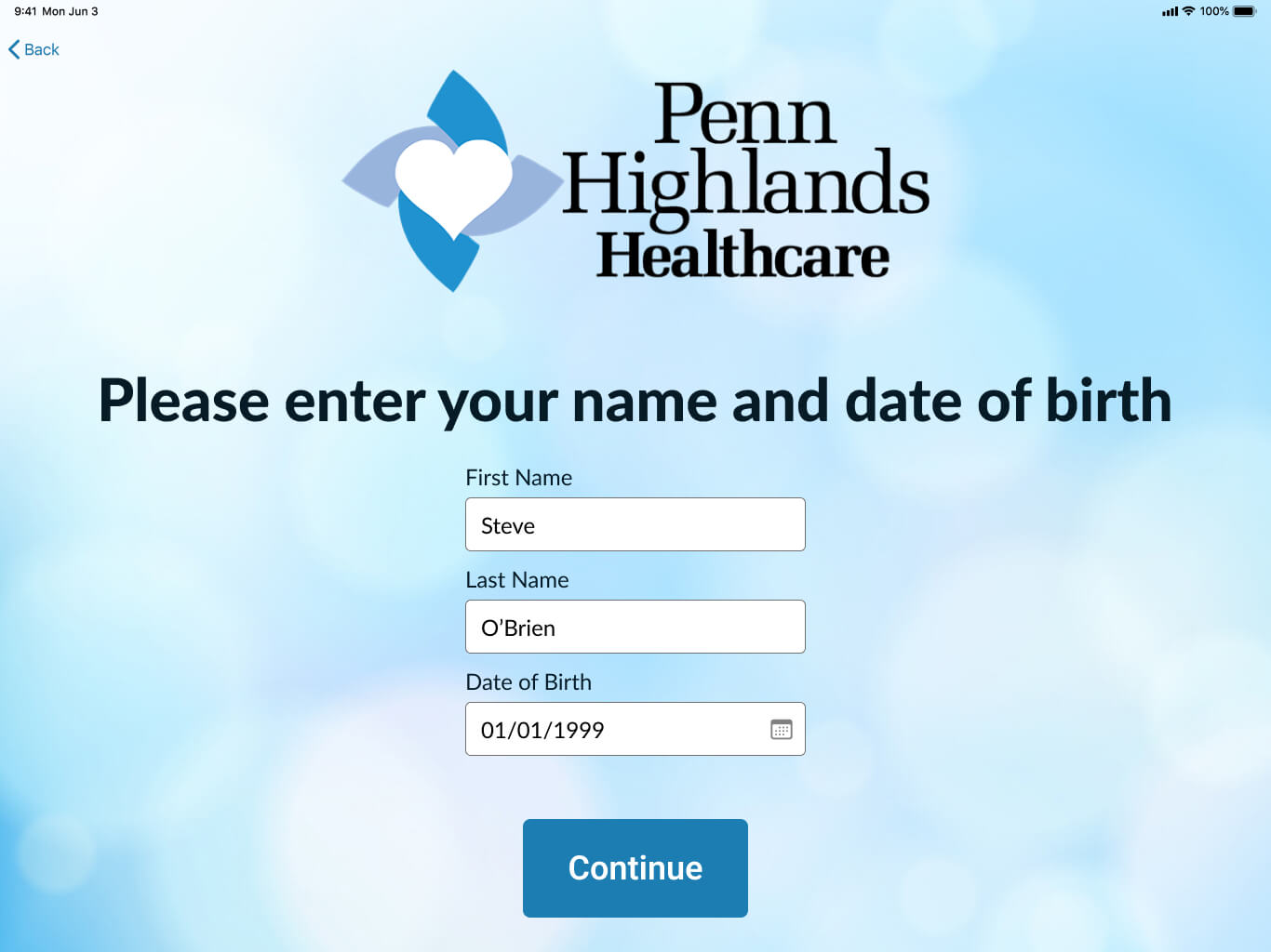
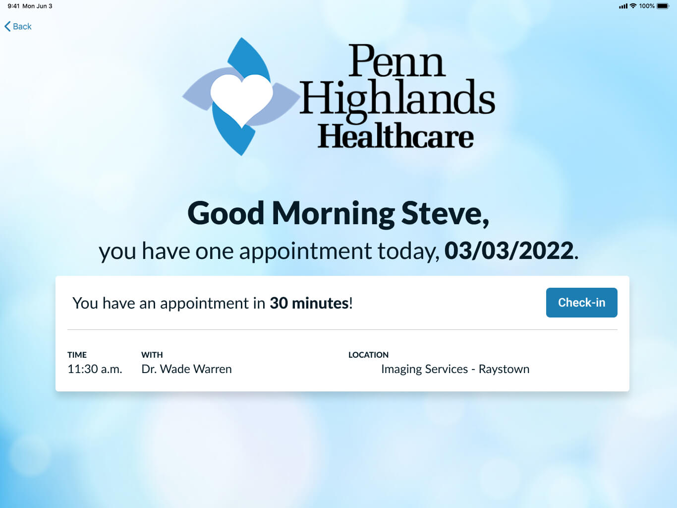
• Making Check-In Simple: Patients first look up their appointment using their name and date of birth. Once matched, they see their appointments for the day in clear, easy-to-scan cards showing the appointment time, time until the visit, doctor, and location. A simple "Check In" button keeps the next step clear.
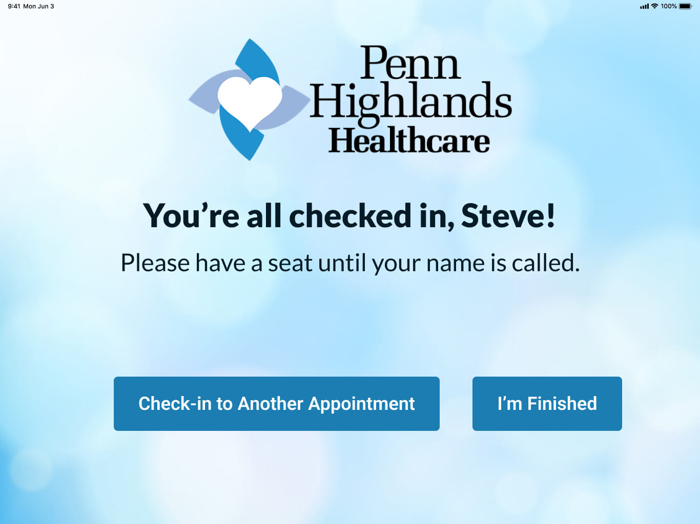
Reassuring Completion Screen
• Clear Waiting Room Directions: The final screen provides immediate closure, confirming the reception team has been notified and instructing the patient where to sit, eliminating anxiety about whether their check-in went through.
Colors & Font
Visual Identity Rationale: For SymphonyCare, we wanted the visual identity to feel calm, trustworthy, and at home in a clinical environment. A palette of Alice Blue, Maya Blue, and Star Command Blue creates a clean, reassuring feel, while Indigo Dye and Rich Black provide contrast and clarity. The Lato typeface ties the experience together with a straightforward, highly legible feel across the kiosk.
Color Palette
Typography: Lato
Lato was a natural fit for SymphonyCare, aligning with the client’s existing brand and marketing guidelines. Its clean, approachable letterforms keep information easy to read and create a consistent experience across the kiosk and desktop portal.